
Commuting Heatmap
I’ve made some more progress on my heatmap project using the Google Maps APIs and produced a couple cool maps of the sum of commute times for my girlfriend (to UCLA) and myself (to Long Beach) from locations across LA.
Below are some of the maps. Scale is unfortunately not always consistent and I don’t have specific numbers (except where mentioned).
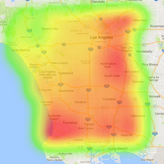
8 am Monday projected travel time. Travel to UCLA: Public Transit; Travel to Long Beach: Driving. When taking transit, it really pays to be close to your destination. The minimum is right around UCLA (and right around where we live!)
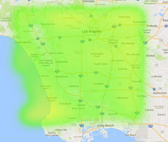
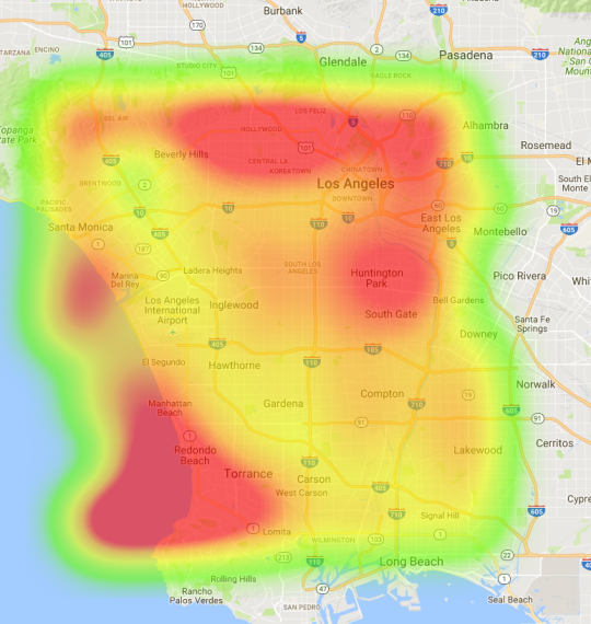
8 am Monday projected travel time. Travel to UCLA: Driving Travel to Long Beach: Driving. The scales on this and the above one are actually the same (the max deep-red is 5 hours of summed travel time). Minimum is pretty much in the same location as before, but the whole length of the 405 is pretty good. Below is the rescaled version to see detail a but better.
There are plenty more variations that would be cool to see, such as transit in both directions, or MIN(transit, driving), or MIN(transit, driving * some_pain_and_suffering_multiplier). But Google really doesn’t like this use of their API and I kept running into query limits. At >100 datapoints, I had to slow the process and add a 5 second delay between requests. This was very tedious and I ended up just letting some of these run while I went to the UCLA football game last night (Go Bruins!). I’m ready to call this project done– at least for now.
This is available on Github, though I’ve killed my API key so you’ll have to BYOK. Note: Keep the dataset small and/or delay high.