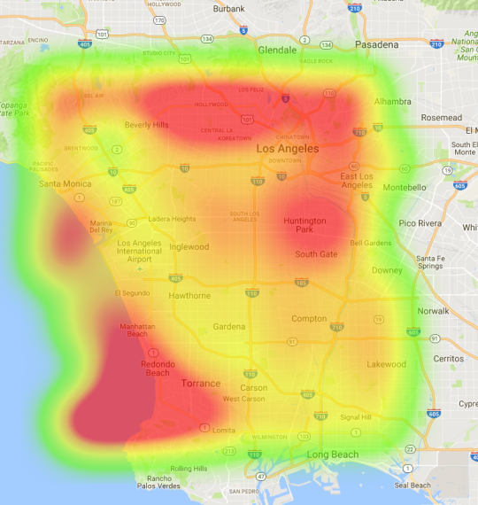
Scrobbling through the years

Spotify lets your hook up your last.fm account to keep track of what music you listen to. I used a last.fm to csv service someone put together to grab my data, then sqlite DB browser to run queries on it. 

The first thing I did was get a list of the top played artist each week as long since July 2013, when I started keeping this data (summary/freqArtist.csv, on the github repo). Not a lot stands out just looking at that, but then I sorted the top artists by how many times they were the top artist of the week (summary/topArtists.csv). 

List of artists with >1 week on the top-artist-of-the-week list:

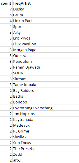
This is arguably a list of my “favorite” artists, since I both listened to them a lot– enough to be top of the week– and they stood the test of time– being listened to over the span of several weeks. And I think the list is pretty accurate.

Next, I took a look at how much I listened to a few artists before/after seeing them live. 

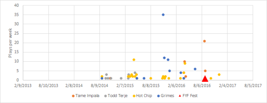
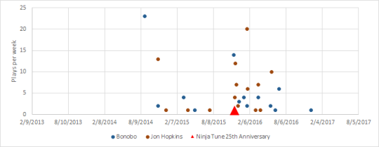
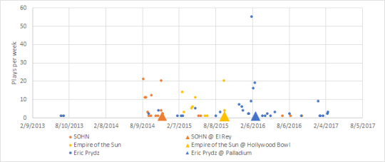
I listened to some artists a lot leading up to the show, then much less immediately after (SOHN, Tame Impala), some that I didn’t listen to much before, then a ton after (Bonobo, Jon Hopkins), and some that I listened to for months before and months after (Eric Prydz, with some serious cramming right before the show).

The .db and ancillary files are on github if you want to see how I did this or judge my music tastes. I had to do a little manipulation of the raw last.fm data, since sqlite didn’t like the way last.fm formatted datetime (see queries/songs2.sql for how I created a view that solved this).

Read More

no title

I was talking with someone who couldn’t believe that I saw an engine-less Ferrari 308 GTB on craigslist for $5k. Hagerty’s historical prices show that, when I looked in mid-2013, that wouldn’t be unheard-of.

image

So Hagerty, what you’re saying is that I should invest my money in air cooled porsches? This site it too cool.

Read More

Commuting Heatmap

I’ve made some more progress on my heatmap project using the Google Maps APIs and produced a couple cool maps of the sum of commute times for my girlfriend (to UCLA) and myself (to Long Beach) from locations across LA. 

Below are some of the maps. Scale is unfortunately not always consistent and I don’t have specific numbers (except where mentioned).

image

8 am Monday projected travel time. Travel to UCLA: Public Transit; Travel to Long Beach: Driving. When taking transit, it really pays to be close to your destination. The minimum is right around UCLA (and right around where we live!)

image

8 am Monday projected travel time. Travel to UCLA: Driving Travel to Long Beach: Driving. The scales on this and the above one are actually the same (the max deep-red is 5 hours of summed travel time). Minimum is pretty much in the same location as before, but the whole length of the 405 is pretty good. Below is the rescaled version to see detail a but better.

image

There are plenty more variations that would be cool to see, such as transit in both directions, or MIN(transit, driving), or MIN(transit, driving * some_pain_and_suffering_multiplier). But Google really doesn’t like this use of their API and I kept running into query limits. At >100 datapoints, I had to slow the process and add a 5 second delay between requests. This was very tedious and I ended up just letting some of these run while I went to the UCLA football game last night (Go Bruins!). I’m ready to call this project done– at least for now.

This is available on Github, though I’ve killed my API key so you’ll have to BYOK. Note: Keep the dataset small and/or delay high.

Read More